Milleis
A private banking app bringing everyday banking and wealth management into one seamless experience.
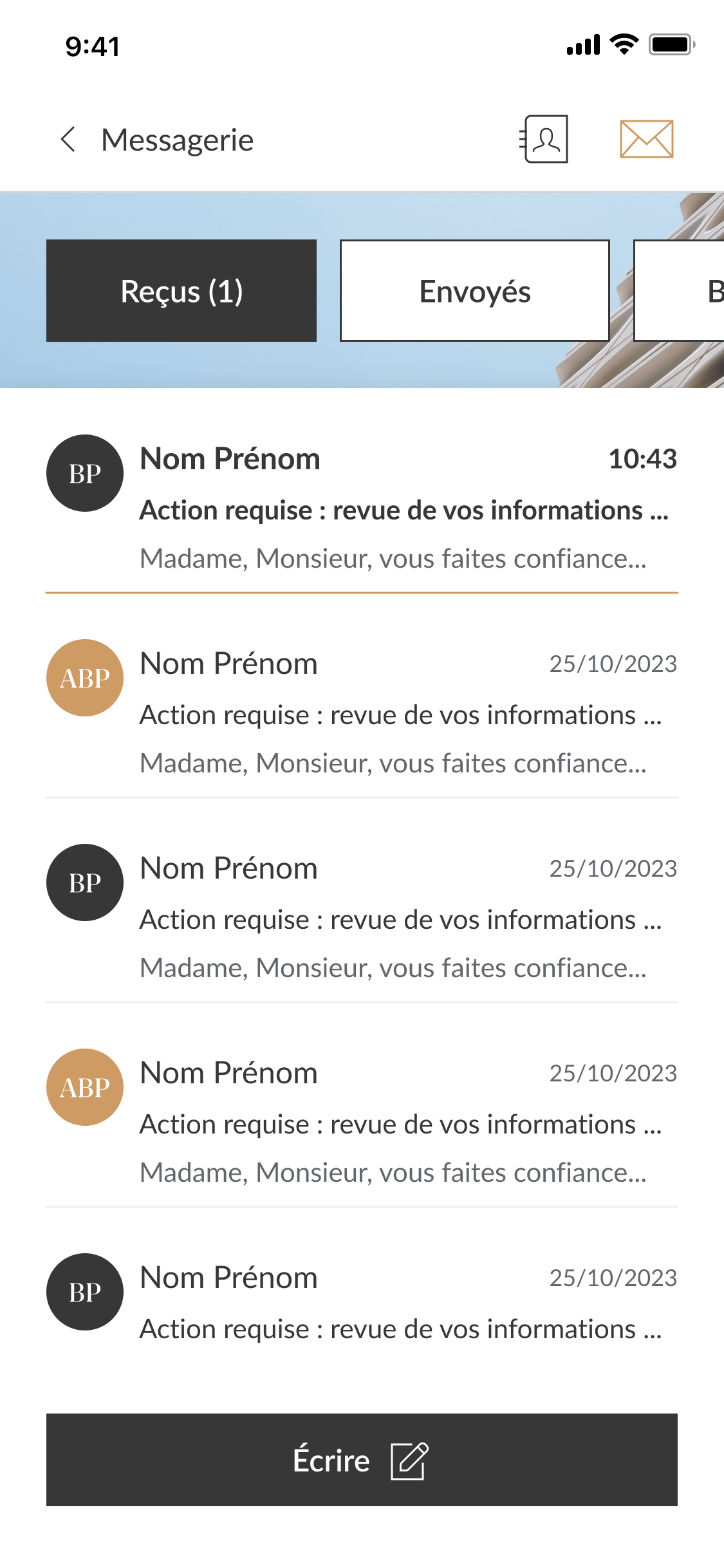
I led the redesign end to end.
As Lead Product Designer, I led the redesign of Milleis' mobile experience alongside two designers and engineering. The work ran end to end, from research to a shipped design system.
- User research
- Information architecture
- UX & interaction design
- Visual design
- Design system
- Team leadership
One banking app for two opposite mental models.
Milleis wanted to grow its app from a traditional banking application into a full wealth management platform. The hard part wasn't adding investment features. It was designing a single experience for two audiences with completely different expectations. One app. Two mental models.
Long-time customers who mainly use the app for daily banking. They value familiarity, reassurance and simplicity above everything else.
More investment-oriented users looking for portfolio performance, market information and deeper financial insights. They expect speed, control and richer experiences.
Three principles behind every decision.
Every design decision should reinforce the feeling of using a single Milleis product, not two separate apps.
Managing wealth is complex. Using the app shouldn't be.
Luxury isn't decoration. It's removing friction so every interaction feels effortless.
One navigation for two very different audiences.
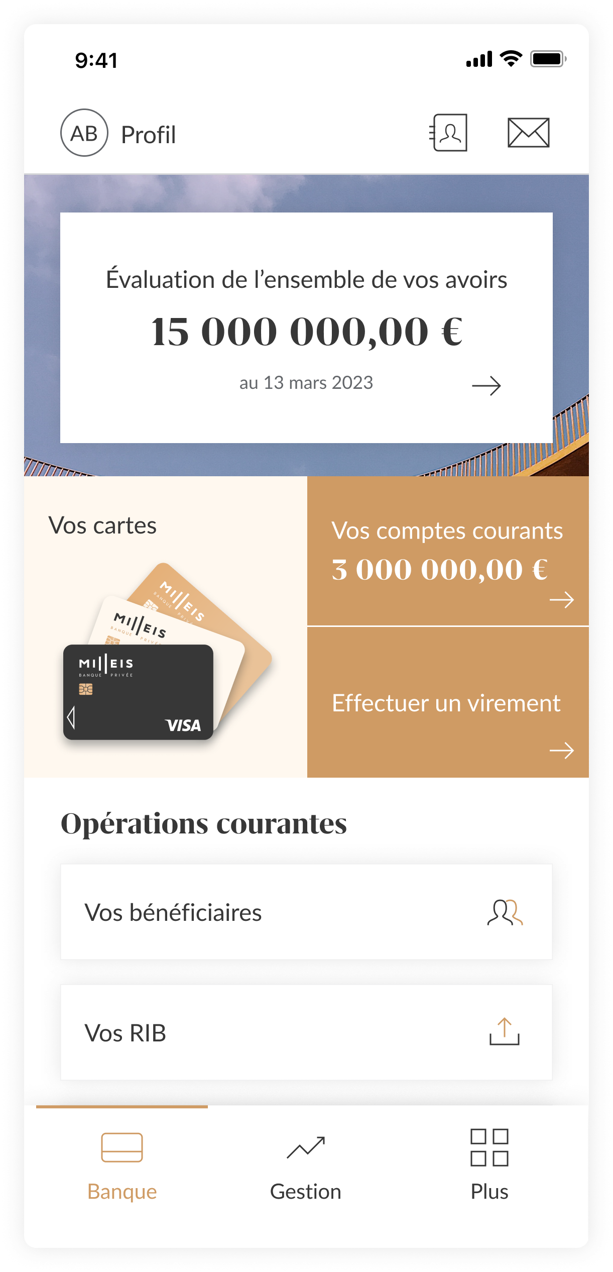
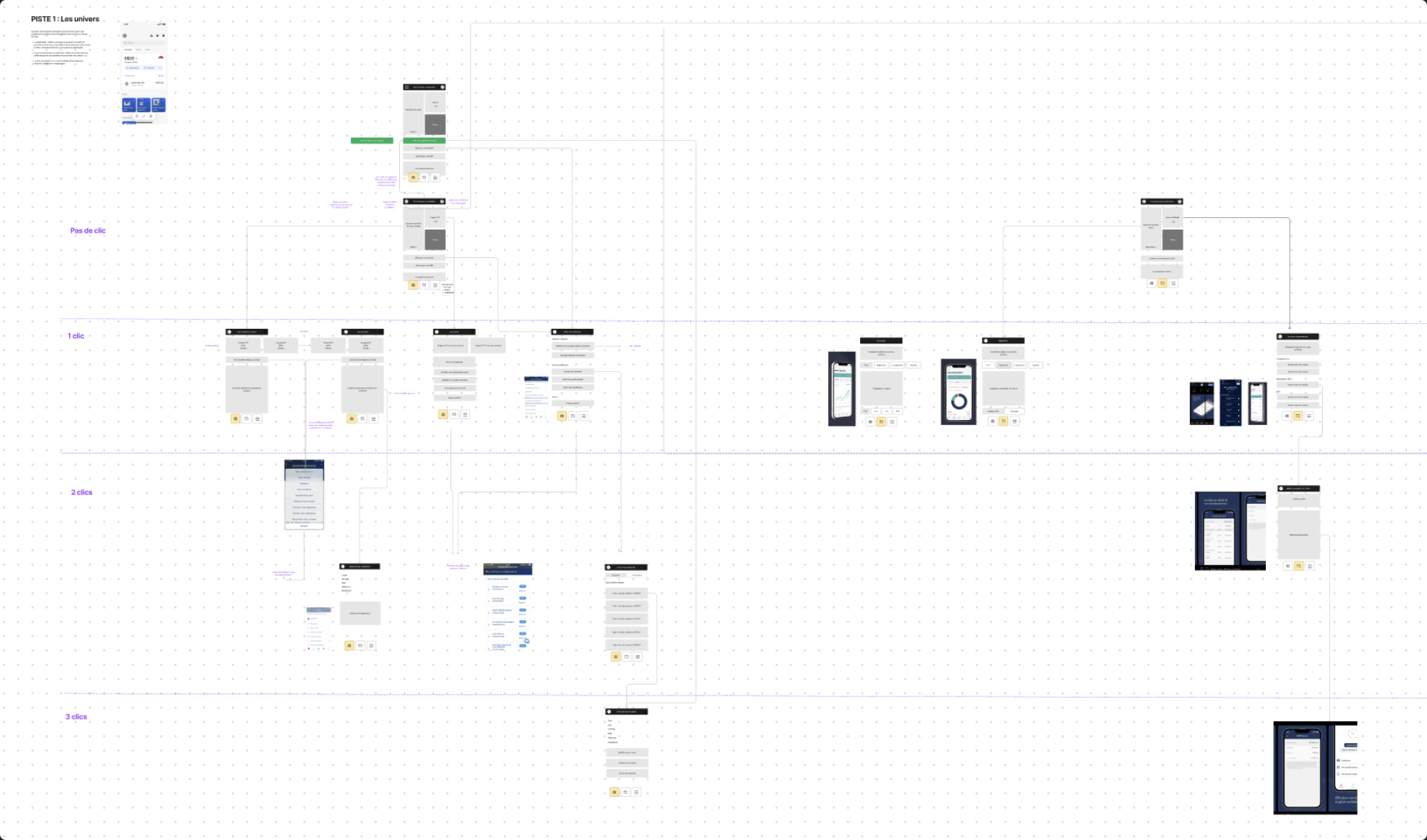
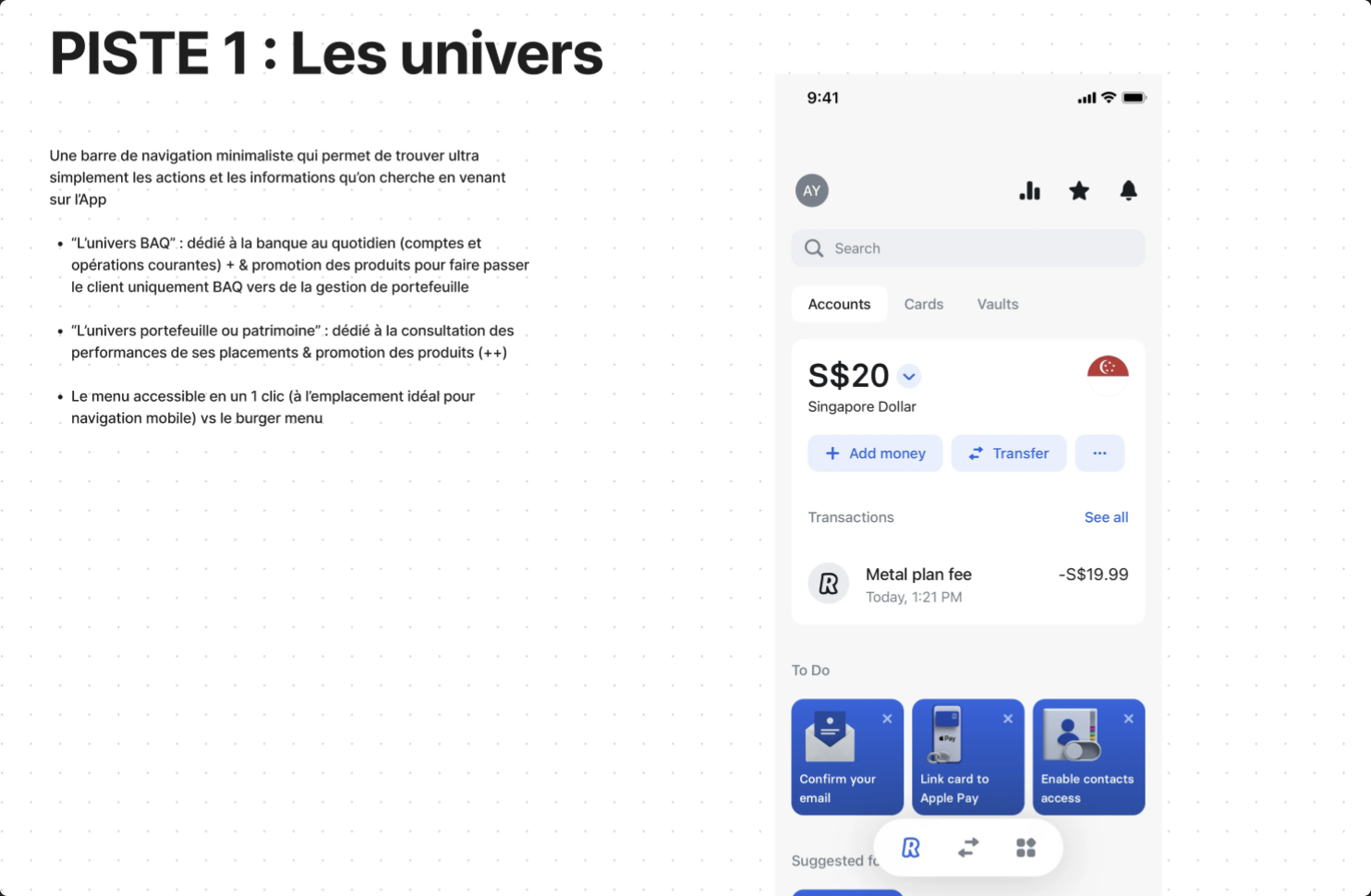
Before redesigning the interface, I rebuilt the product architecture. Through research and testing, I introduced a navigation model based on interaction depth, letting two very different customer journeys coexist within a single app.
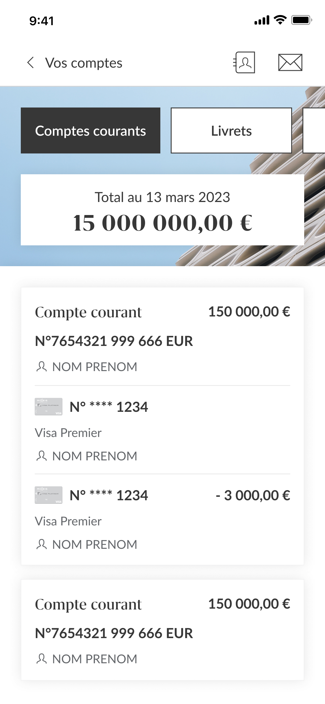
Total assets, accounts, the one number each client opens the app for.
Transfers, cards, beneficiaries, placed in the thumb zone, not a burger menu.
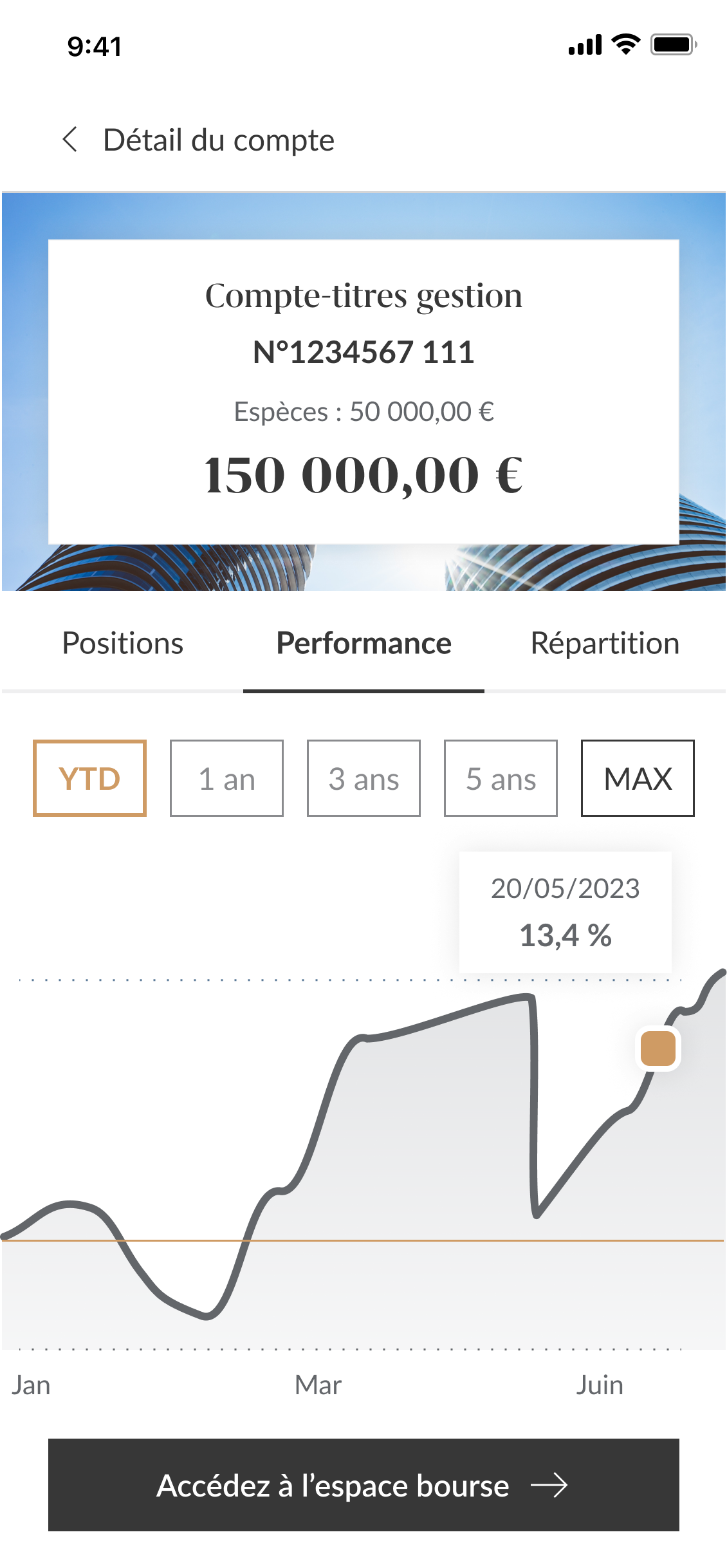
Account detail, portfolio performance, positions and allocation.
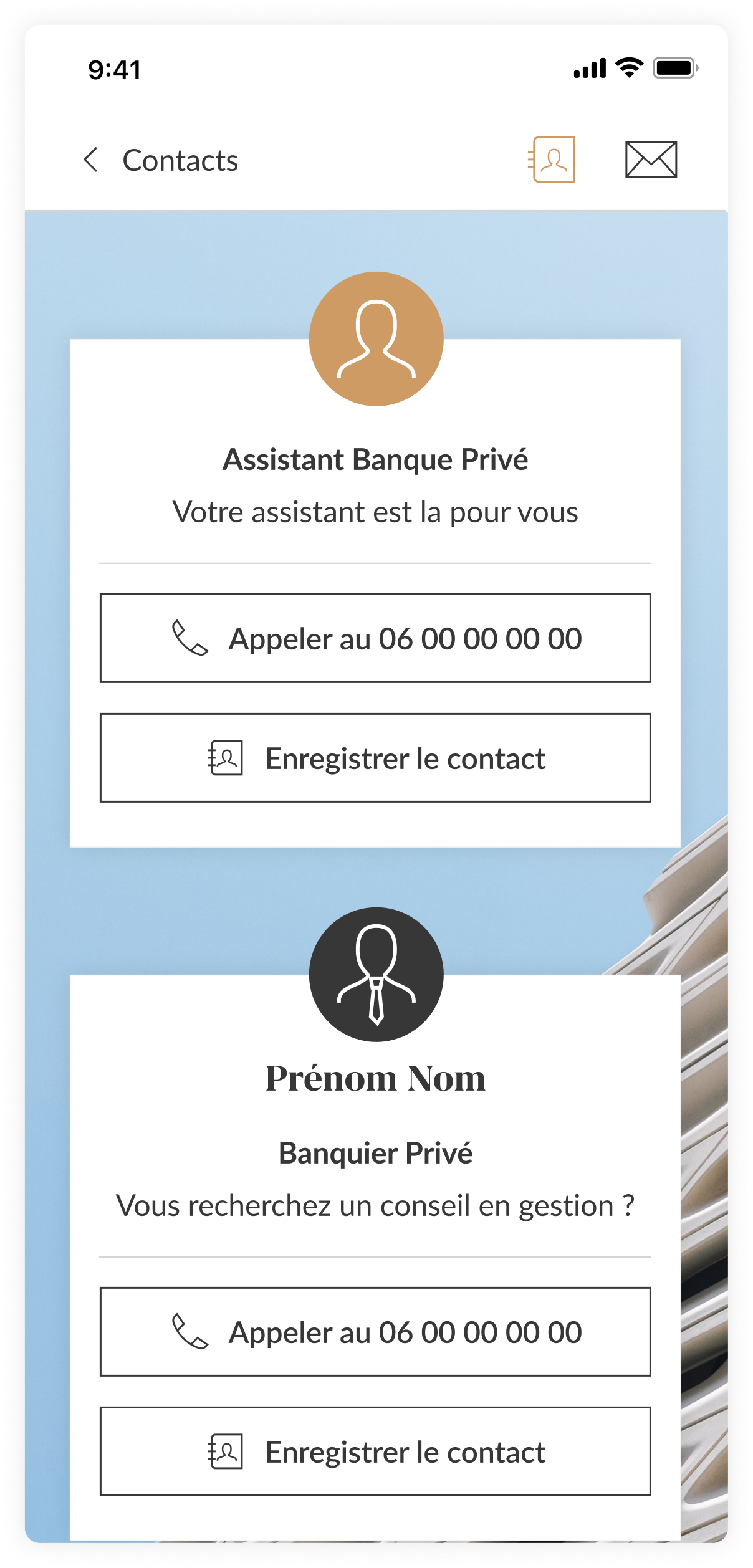
Edge settings and one-off operations, kept out of the way.
Different experiences. Shared foundations.
Rather than averaging both audiences into one experience, I designed two visual territories built on the same navigation and design system. Historical clients got a familiar banking experience, while wealth clients accessed a more performance-oriented one, without ever feeling like they used a different product.
One system supporting the entire platform.
I built a scalable design system shared across both universes, so new banking and investment features shipped faster while staying consistent.
Enough trust earned to roll the research-driven redesign across the product, and to open the door to new AI tools for the private bankers.
Visit milleis.fr ↗Premium is helping people navigate complexity with confidence.
Designing premium products isn't about making interfaces look luxurious. Milleis reinforced my belief that good information architecture often has more impact than visual design alone.